Case Study 03 · Non-profit
Chicago Public Art Group: a content-first redesign.
A beautiful site about the murals, statues and mosaics of Chicagoland that nobody could act on. We took the colour away, and the structural problems had nowhere left to hide.
Organisation
Chicago Public Art Group
Team
3 UX designers
Duration
3 months
Methods
Heuristic evaluation, content testing, site mapping
The Problem
Good branding can mask poor content.
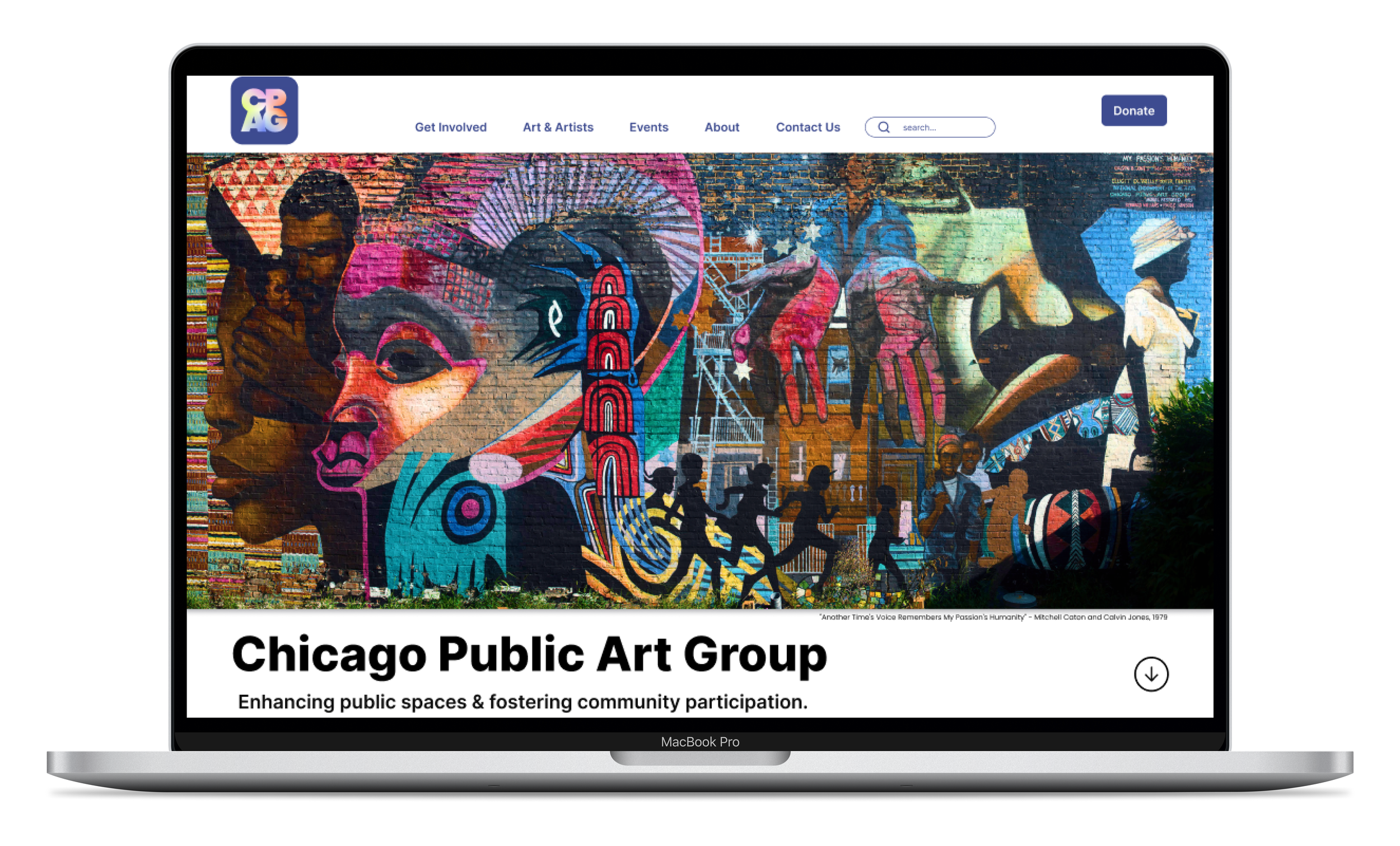
CPAG's site manages murals, statues and mosaics across the Chicagoland area — genuinely lovely material, presented in a way that left visitors with nothing to do. Our opening heuristic evaluation turned up a consistent pattern.
- Unclear user goals. The site never said what a visitor was there to do.
- Long lists of confusing links where a structure should have been.
- Buttons that didn't look clickable — and so weren't clicked.
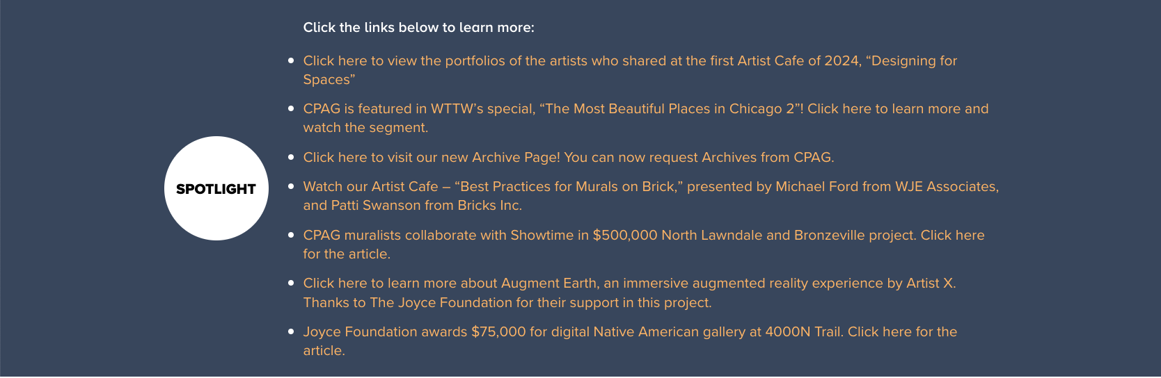
- Inaccessible colour contrast in the Spotlight section.
- Missing or hidden calls to action on pages that badly needed them.
- An oversized header with dropdowns eating the top of every screen.
Research
Content testing in greyscale.
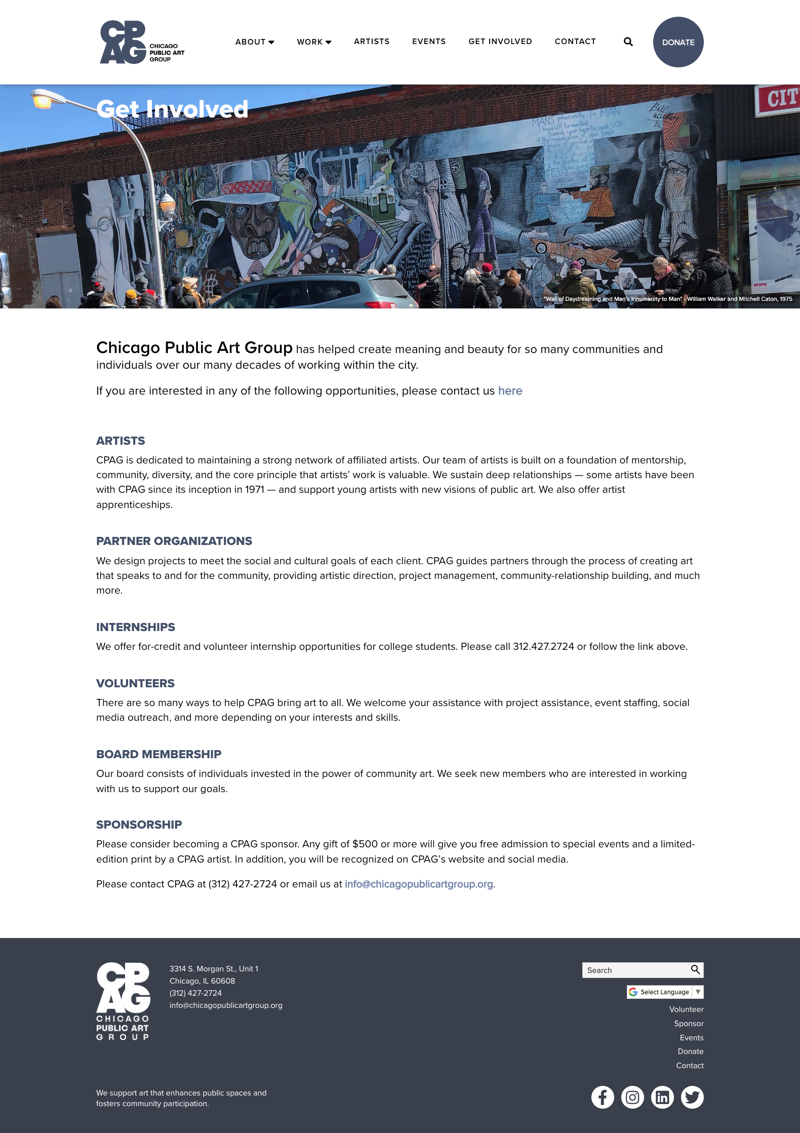
We rebuilt the existing site as greyscale wireframes and put them in front of users. Stripping out the photography and the palette was the entire point: it meant nobody could be carried through a task by how nice the page looked.
The task was concrete — get to the Get Involved page and complete the contact form to volunteer for a mural initiative.
The finding: users struggled to locate calls to action at all. The site had no clarity about what a visitor should do beyond looking at things. For an organisation that runs on volunteers and donations, that is not a cosmetic problem.
Good branding can initially mask poor content.
Design Solutions
Fewer pages, clearer moves.
Reorganise the site
- Consolidated three redundant pages — Who We Are, Mission and History and People — into one.
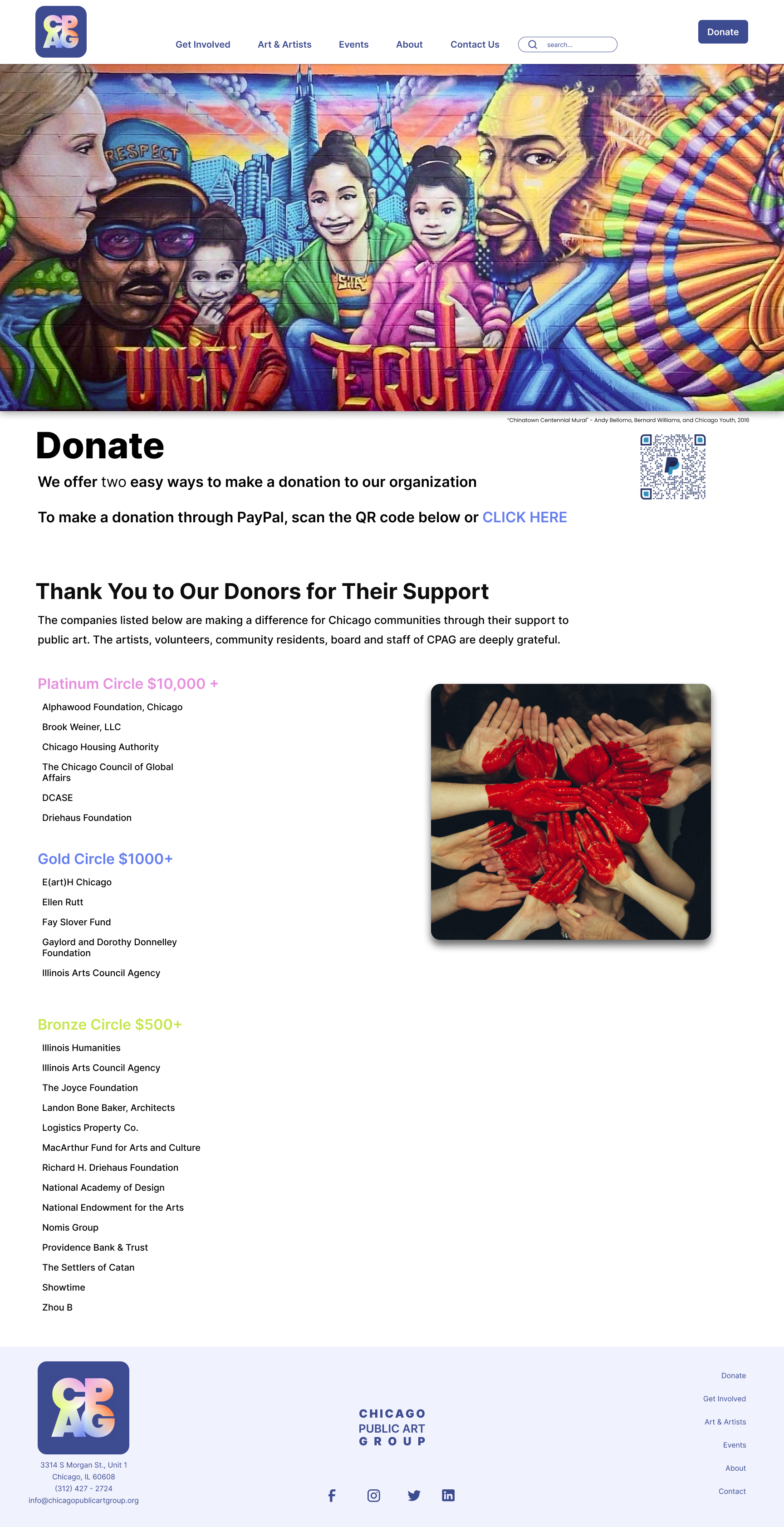
- Merged Donate and Funders, so existing supporters became social proof for new ones.
- Made sure cross-page links pointed somewhere useful: donation, or contact.
Rebuild the homepage
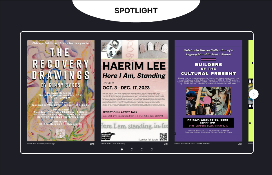
- Turned the long Spotlight link list into a carousel people would actually look at.
- Redesigned the cards with the key information bolded.
- Added prominent, ordinary-looking call-to-action buttons — the kind users already know how to use.
- Streamlined the header navigation and gave the page its top back.
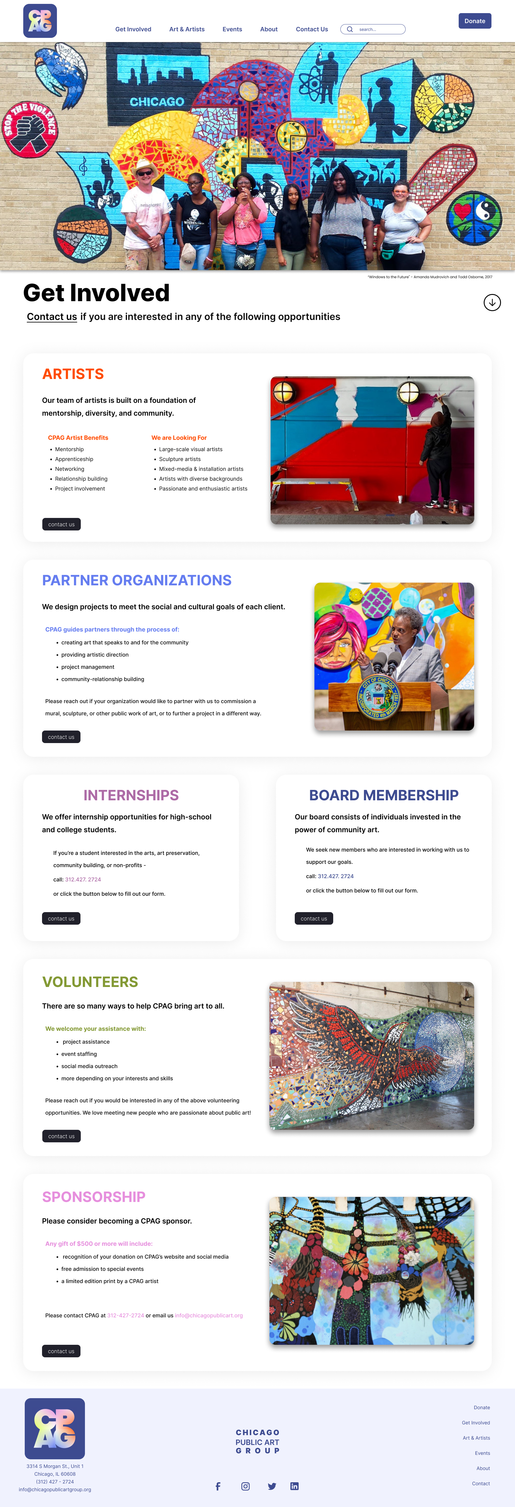
Fix "Get Involved"
- A call-to-action button for every category, not one at the bottom of the page.
- Content reorganised into scannable cards.
- Meaningful colour coding rather than decorative colour.
- Paragraphs replaced with bulleted lists wherever the paragraph was really a list.
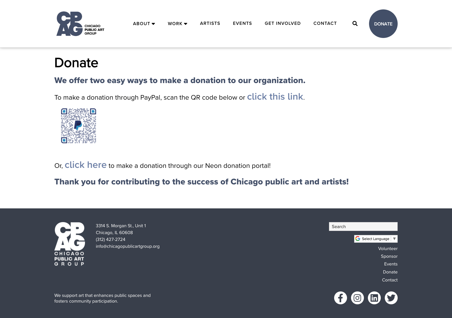
Before & After
Drag to compare.
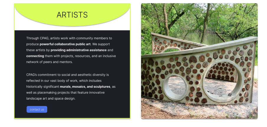
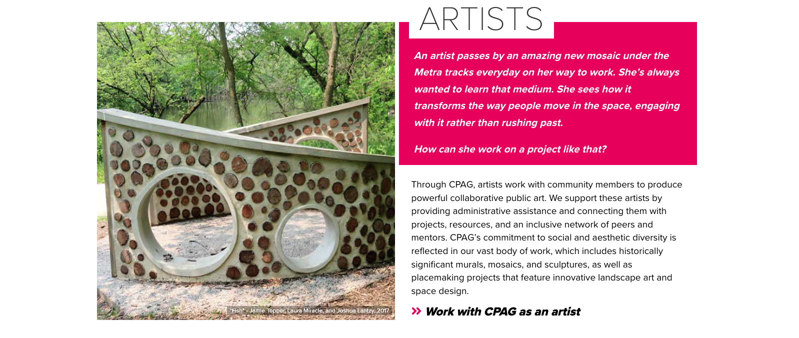
The brand stayed. The structure changed underneath it — link lists became browsable cards, and every page got a call to action that looks like one.
Drag the handle — or focus it and use the ← → keys


Outcome
A site that asks for something.
- Improved site organisation, built around focused user goals rather than the org chart.
- Stronger calls to action for donations and contact requests.
- Content that is genuinely scannable — and accessible.
Reflection
What I learned
The greyscale wireframe is the sharpest tool I took away from this project. A good-looking page can carry a broken structure a surprisingly long way — long enough that everyone involved stops noticing. Remove the colour and the photography and the page has to survive on its content alone. Most of the time it doesn't, and then the conversation gets a great deal easier.
The second thing was about non-profits specifically. A mission-driven organisation is often so close to its own material that it forgets to ask for anything. Every page was about the work; almost none of them invited anyone into it. Fixing that was mostly editorial, not visual.
And working in a team of three taught me that a heuristic evaluation is worth far more when three people do it separately and compare notes. The problems we all found independently were the ones worth spending three months on.
Next case study